Chase Shopping internal retail hub
THE CHALLENGE
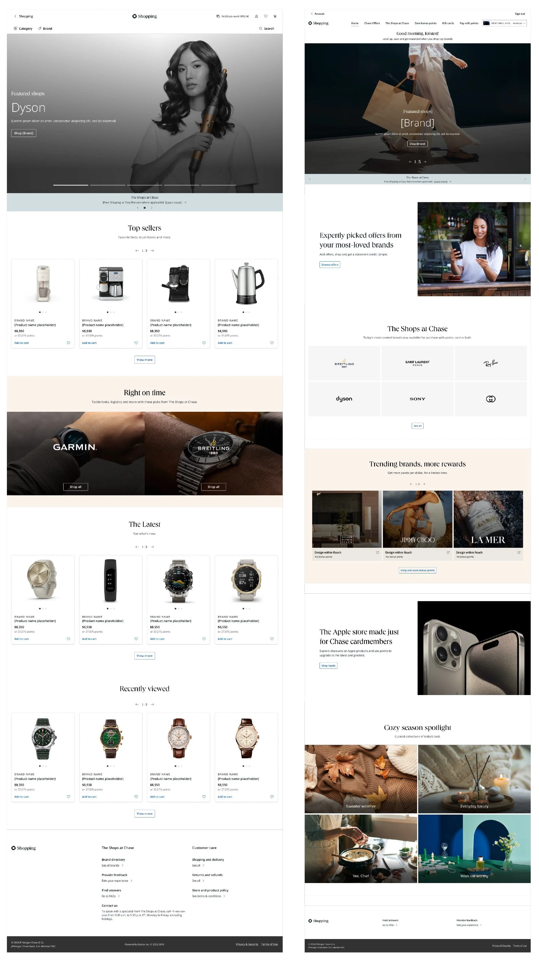
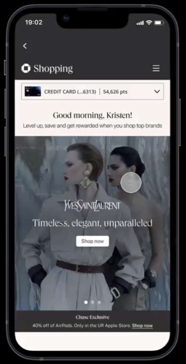
Chase needed a shopping hub that felt easy to use, modern, and unmistakably Chase — while carrying the elevated, luxury sensibility of Sapphire. The challenge was to create a premium commerce experience that felt curated and high-end, without sacrificing clarity, accessibility, or everyday usability.
ROLE
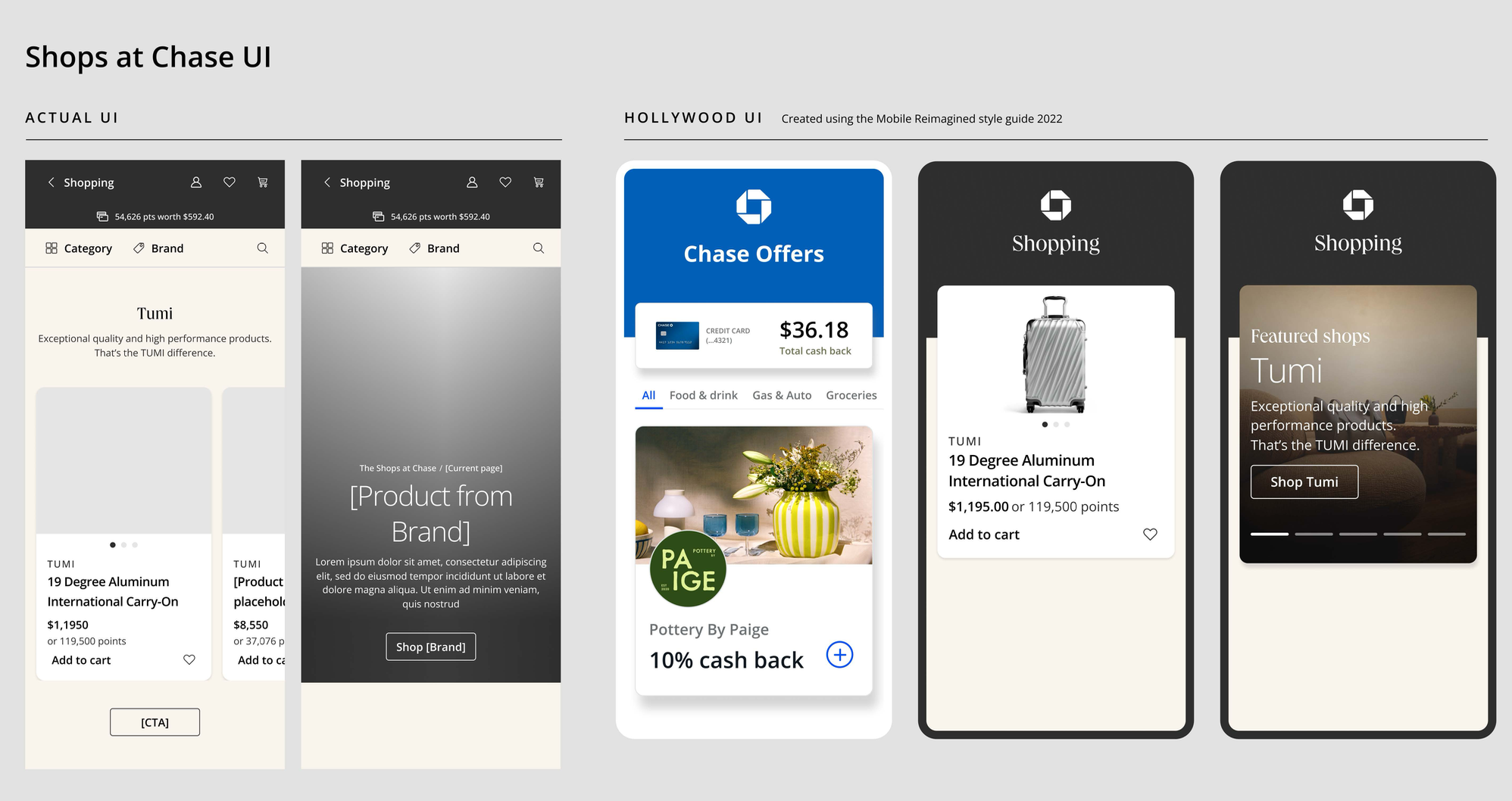
As the owner of the Chase brand guidelines, I provided creative direction across the product design, reviewing and approving the experience to ensure it aligned with the broader Chase brand system and the more refined world of Sapphire. My team managed creative intake and helped define how color, contrast, hierarchy, and branded UI moments should be applied across the experience — ensuring the product felt polished, intuitive, and bespoke without becoming visually heavy.
METHODOLOGY
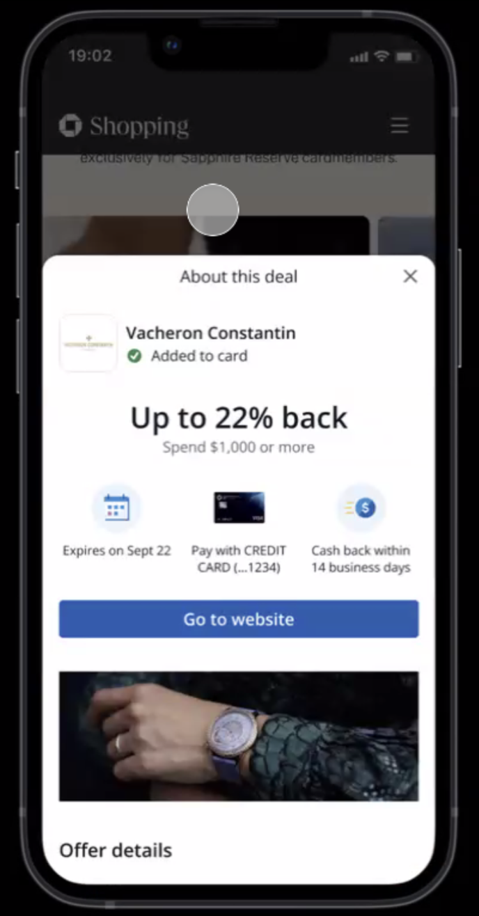
We evaluated the shopping hub through both a brand and product design lens, looking closely at color strategy, UI hierarchy, interaction states, content modules, and visual consistency across screens. This included assessing how primary and secondary brand colors could function within a product environment — from calls to action and navigation cues to accent moments, offer modules, and supporting surfaces. The goal was to use color with intention: reinforcing wayfinding, creating emphasis, supporting accessibility, and bringing a more elevated Chase Sapphire feel into the customer journey.
IMPACT
The final experience helped bring a more premium and cohesive expression to the Chase shopping ecosystem. Through creative direction on product design and thoughtful application of the brand color system, we supported a customer journey that felt clear, modern, and elevated — connecting the everyday utility of shopping with a more high-end, Sapphire-inspired Chase experience.