Chase x JPMORGAN app color rebalancing
THE CHALLENGE
As both the Chase and J.P. Morgan apps prepared to launch dark mode support, it became clear that our existing color systems were fragmented and inconsistent. Brand colors rendered differently across platforms, and shared functional color tokens risked conflicting with semantic (status/alert) colors. We needed to create a unified, accessible, and scalable color system that preserved brand integrity, supported dark mode, and ensured clear, consistent meaning across both apps.
ROLE
I oversaw and approved the color rebalancing initiative across the Chase and J.P. Morgan apps. While my team handled the detailed design execution, I provided strategic guidance and final sign-off to ensure brand integrity, accessibility, and consistency across both product experiences.
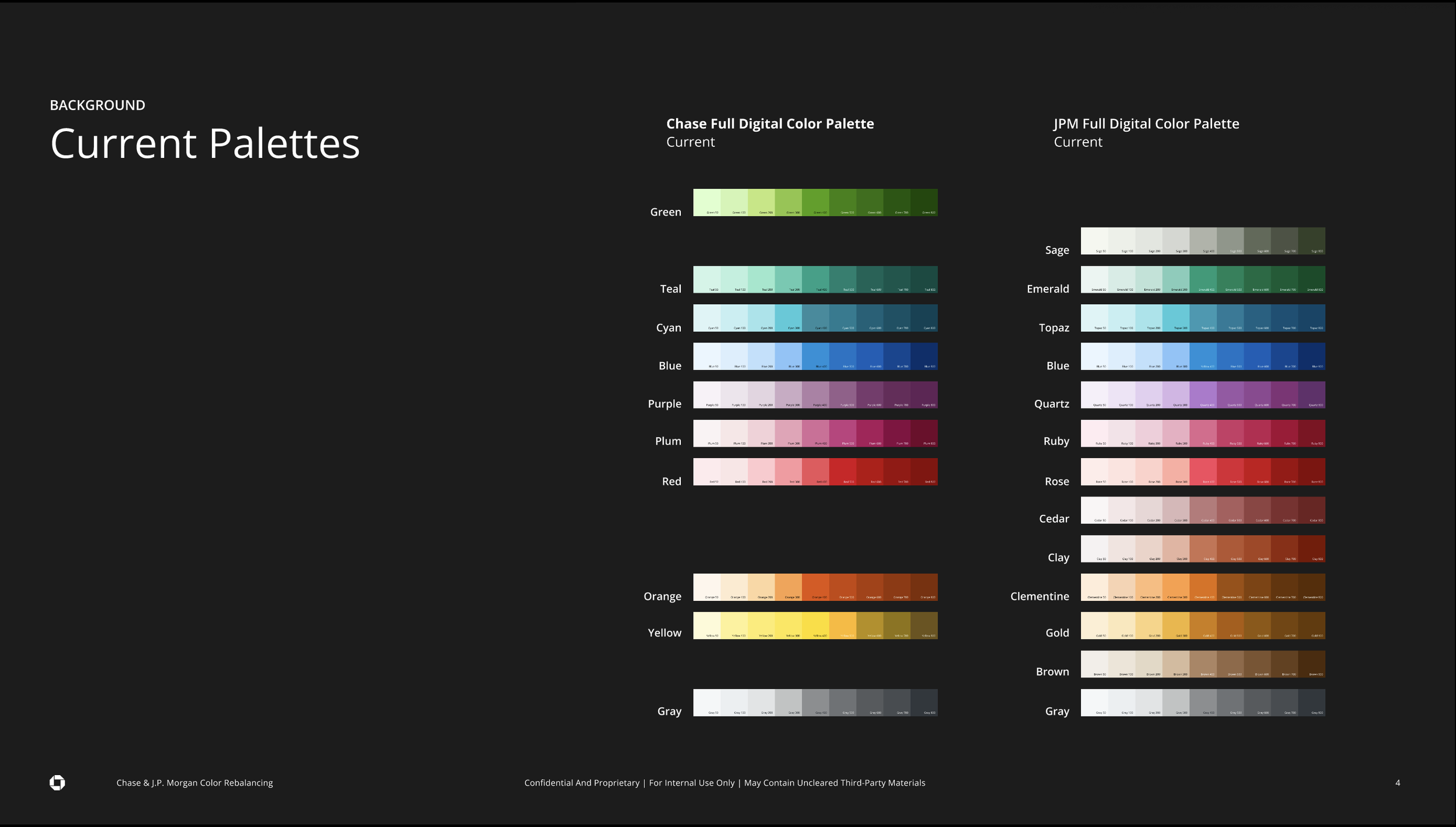
METHODOLOGY
Our digital customer engagement team conducted a comprehensive audit of the existing color systems, identifying discrepancies in how brand colors rendered across platforms — particularly in light and dark modes. We balanced brand alignment with functional requirements, ensuring shared color tokens between the Chase and J.P. Morgan apps while maintaining clear semantic color meaning and accessibility standards.
IMPACT
The result was a unified, accessible color system supporting both light and dark modes across apps, improving visual consistency, usability, and brand recognition. This work laid the foundation for scalable design tokens that future-proof cross-app consistency while meeting modern accessibility guidelines.